Facebook has rolled out a new look for Pages. I love the changes. It is more streamlined and a better experience for viewers and admins. Most, of all, I love that they removed a major irritation (see point 5). Here are my favorite changes:
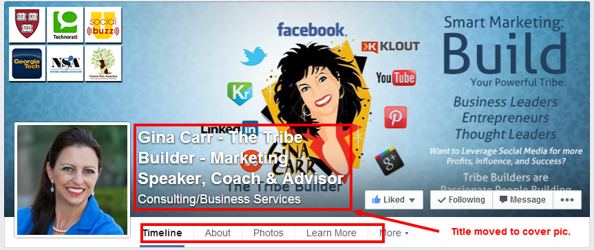
1. Page Name Change. Most noticeable is the change in the placement and color of the Page name. Instead of being below the cover photo and black, it is now INSIDE the cover photo and white. This is going to necessitate new cover images for many as the white letters need to be on a dark background in order to show.
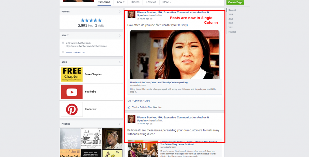
2. Single Column Timeline. Posts are all in a SINGLE column on the right side. This is SO much better than the two column format that was confusing. The width has changed from 403 pixels to 511 pixels wide. This allows much wider, nicer custom images.
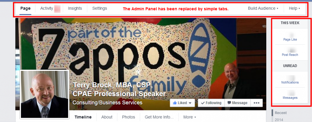
3. Page Administrators Panel removed. For Page Administrators, the administrative data has been reduced significantly and moved to be around the Cover image. This is a much better experience for the user.
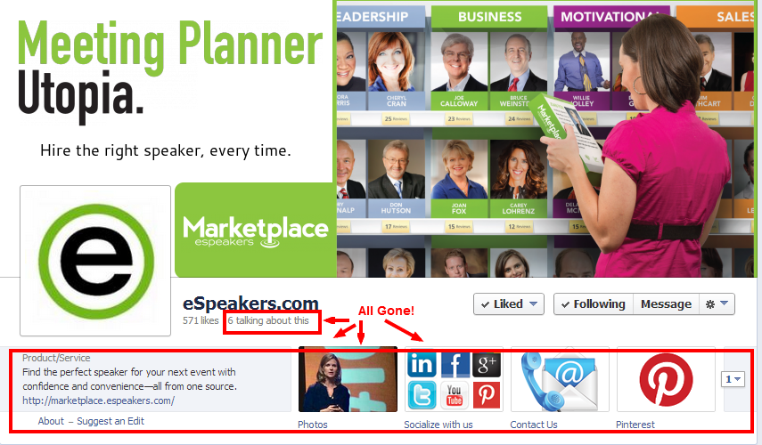
4. Description and Tabs removed. Facebook has removed the description and “tab” features. These “blocks” have been turned into menu-like tabs that are much more similar to a regular website. You can change two of the tabs by selecting the apps that you want displayed. I never liked the custom tabs and I am glad to see them go!
5. People Talking About This – PTAT – has been removed. Hallelujah! This is my favorite thing about the new Page layout. Since Facebook makes it so hard to get traffic to Pages, they were adding insult to injury by broadcasting to the world how many people were actually interacting with the page.
I believe it is better for those numbers to be private for Page Administrators only. Perhaps I will start marketing my Page a bit more now that this number is no longer visible to the world.
There are many more changes to the computer version and the mobile layouts. These are a few of my favorites. What do you like or not like about the new Facebook Page look?
Note: As of this writing, some Pages do not have the new look. All Pages will have the new design as of mid-June 2014.
Related articles:
How to Name Your Facebook Page – 5 Keys to Getting Found
Facebook for Business: Get a Vanity User Name for Your Facebook Page or Personal Profile
Gina Carr
Latest posts by Gina Carr (see all)
- How to Handle a Negative Review with Marilyn Suttle, Customer Service Expert – BLAB - March 8, 2016
- How to Get More Great Reviews … And Fewer Bad Ones! - December 31, 2015
- Christmas Eve at the Emergency Vet - December 25, 2015


